
The headshot field guide · Backgrounds
Choose a headshot background
The best background is the one that helps your face read clearly in its final setting. A white background is not automatically more professional, and a blurred office is not automatically more convincing. Start with where the image will appear, then compare the light, clothing and edges of the portrait as a whole.
HeadshotGenerators.ai ·
Three background directions in context
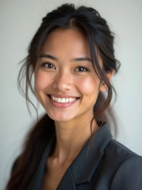
These are separate synthetic illustrations, not the same person photographed under controlled conditions. Use them to compare visual direction, not to measure which background produces better results.
Synthetic AI illustration
Light gray: a quiet starting point
This is light gray, not pure white. The dark jacket has a readable outline. On a very pale webpage, the image still has an edge; check that a pale shirt does not disappear into the backdrop.

Synthetic AI illustration
Medium gray: controlled contrast
A middle-tone background avoids the starkness of bright white. Inspect hair, jacket and face separately: skin tone alone does not tell you whether the whole portrait has enough contrast.

Synthetic AI illustration
Office context: more information
Windows and architecture suggest a workplace. That context can help a biography, but it competes with the face in a small avatar. Do not present an invented office as evidence of your actual workplace.
White, gray, color or a real setting?
Choose against the destination’s actual brief. The trade-offs below are editorial guidance, not platform requirements or a promise that our generator offers an exact backdrop color.
White / off-white
- A useful choice when…
- A company directory calls for a clean, bright and consistent presentation.
- Watch for…
- Lost edges on white clothing, blown highlights, and a cutout that looks pasted onto a blank field.
Light or medium gray
- A useful choice when…
- You want a restrained profile portrait that works beside different page colors.
- Watch for…
- Flat light or dark hair and clothing merging with a similar gray.
Dark or charcoal
- A useful choice when…
- A leadership bio or editorial design calls for a darker mood.
- Watch for…
- Shoulders disappearing and shadows hiding facial detail, especially at small sizes.
Muted color
- A useful choice when…
- A portfolio or brand has a specific, agreed visual direction.
- Watch for…
- Color casts on skin and a backdrop that attracts more attention than the face.
Office / outdoor context
- A useful choice when…
- The setting adds relevant information to a personal biography.
- Watch for…
- Busy lines, signs, bystanders, uneven light or invented context that misrepresents you.
Compare the background without changing the face
Original color diagrams, not photographs or generated output samples. The same simplified figure is shown against three flat colors; real lighting and skin detail will behave differently.
White
A white field makes dark clothing distinct. Real white-on-white clothing needs enough shape and light variation to remain readable.
Mid gray
Gray changes the separation around both hair and clothing. Judge all of those edges, not just the background in isolation.
Warm neutral
A warm tone changes the overall feel. Preview it against your actual site or profile interface before committing to a brand palette.
Match the background to the destination
For a small profile icon, reduce visual noise and check the face at thumbnail size. For a company directory, ask for the shared crop, background and lighting brief before creating a new photo. For a speaker page or personal website, a wider contextual setting can be useful if the face remains the focal point.
Do not infer an upload rule from another person’s example. Platforms and employers can ask for different file types, sizes and framing. Check the current destination instructions; a professional profile is not an official identity document, and an AI portrait is not suitable for a passport.
Check contrast around the whole person
Begin with the boundary around hair and shoulders. Dark hair on a dark backdrop may need different lighting; a white shirt against a white wall may lose its outline. Judge the actual photo instead of assigning a background by skin tone. People with the same skin tone can have different hair, clothes and lighting needs.
Look for color reflected from a wall onto the face. Strong colored light can make a neutral outfit look tinted and alter how skin appears. Choose the background together with the light and clothing, then compare the photo with how you look in ordinary neutral light.
- Inspect the image at full size for halos around hair, ears and glasses.
- Preview a small circular crop and the intended rectangular crop.
- Check it on the actual light or dark page where it will appear.
- Keep the original file; export copies without stretching the portrait.
A simpler background at home
Start with a plain wall or an uncluttered area. Move yourself away from the wall enough to reduce a hard shadow if space allows. Turn toward soft window light and adjust your position so your eyes are clear. Take a test photo before changing anything else.
Check the frame edges for doorways, lamps and objects that appear to grow out of your head. Move the camera or yourself to remove the distraction. A quieter composition at capture is often easier to evaluate than a heavily edited background. This is a practical starting point, not a fixed studio-distance rule.
Changing a background does not fix every photo
A replaced background must agree with the light and perspective on the person. A dark, strongly side-lit face can look unnatural on a bright flat white field. Check for cutout edges, missing hair strands, duplicated glasses and inconsistent shadows after any edit.
HeadshotGenerators.ai does not provide a background editor on this page. Our style examples show possible directions, not guaranteed exact color matching or team-brand compliance. Use the preview to inspect an actual result. If an employer requires a precise backdrop, an unaltered photo or controlled studio lighting, follow that brief and consider a photographer.
Frequently asked questions
What is the best background for a professional headshot?
There is no single best background. Start with the destination’s brief. A quiet white or gray background can suit a directory; a relevant setting can suit a biography. Keep the face readable and inspect contrast around hair and clothing.
Should a headshot have a white or gray background?
White can support a bright, consistent directory, while gray can provide more separation from a light page or white clothing. Compare the actual lighting and outfit instead of choosing the color alone.
Can I change my headshot background on this page?
No. This is an editorial guide, not a background removal or replacement tool. The illustrations explain choices; they do not promise an exact backdrop or editing capability in the generator.
Is an outdoor headshot background professional?
It can be appropriate when the setting fits the purpose, the light is readable and the scene does not distract. Follow any employer or publication brief, and avoid implying that a generated location is your actual workplace.
Which background works with my skin tone?
Evaluate the whole image: hair, clothes, skin, light and destination colors. Skin tone alone is not a reliable rule for assigning a background. Check that facial detail is preserved and that the person separates from the setting.
Sources and context
- Headshots.com: professional headshot examples
External photographed examples showing different background and clothing directions. Our selection checklist is editorial advice.
- Bundesagentur für Arbeit: application-photo tips (German)
For the German application context, the agency recommends a neutral setting and suitable clothing; this is not a universal platform upload specification.
Choose a direction, then check your result
Start with one preview if an AI portrait fits your use. It does not guarantee an exact background, a likeness match or a ready-to-use result. Read the free-preview conditions first.
See free-preview details